Godonation App & Responsive Web
This case study is based on one of the Google UX Design certification design projects to create a platform about goods donation.

Project Overview
GoDonation is a revolutionary goods donation solution for millennials. The intuitive interface allows for quick item selection, locating recipients, and scheduling pickups to suit busy schedules.
My Role
UX designer leading the app and responsive website design from conception to delivery.
The Problem
Millennials who have high concerns want to contribute by donating goods to foundations without having to bother going through the donation process. The items to be donated are used items that are still usable but are no longer used by their owners, so often they choose to just throw away their items
Understanding The User
User Persona
To continue the existing research process, I identify user needs and goals in user personas. This data will be used in a brainstorming process to define and improve the user experience. The problem statement is Surya, a student who likes the development of fashion trends, needed to find a foundation that needed help quickly donating goods because he wanted to save time and be able to quickly pack the donated goods.

Competitive Audit
An audit of a few competitor’s products provided direction on gaps and opportunities to address with the Godonation app.


Click to view the full competitive audit
Starting The Design
Digital Wireframes
As the initial design phase continued, i made sure to base screen designs on feedback and findings from the user research.

Click to view the full lo-fi prototype
Usability Study
I conducted two rounds of usability studies. Findings from the first study helped guide the designs from wireframe to mockups. The second study used a high-fidelity prototype and revealed what aspects of the mockups needed refining.
Round 1 findings
1. User want a foundation filter feature
2. User want to set pick up date
3. User need information delivery estimates
Round 2 findings
1. Color contrast slightly lacking
2. User want to view history donations
Refining The Design
Mockups
Early design required the user to enter the foundation's address for donations, but after a usability studies, I placed the address below the foundation's name information so that it is more visible to the user and there is no need to input the address again.
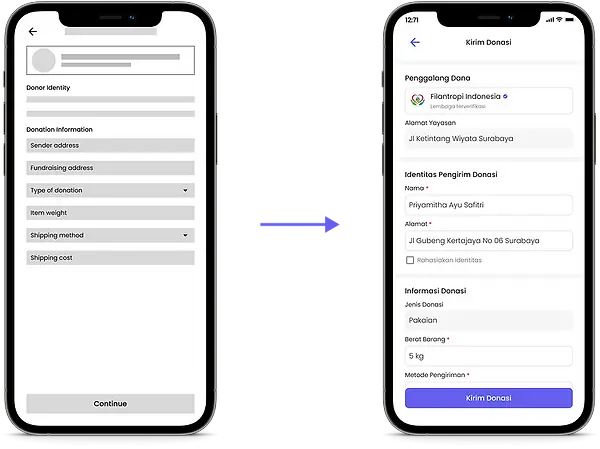
The second usability study revealed frustation with donation status. Previously, status of the donation could only be seen in the delivery information. But after usability studies, I added the status of the donation along with the estimated delivery at the top of the page.

Here is the ultimate mockup for the GoDonation application.

Click to view the full hi-fi prototype
Accessibility Consideration
1. Provided access to users who are vision impaired through adding alt text images for screen readers
2. Used icons to help make navigation easier
3. Used a progress bar and a description of the results of donations received to help users understand the design
Responsive Design
Sitemap
With the app designs completed, I started work on designing the responsive website. I used the Godonation sitemap to guide the organizational structure of each screen’s design to ensure a cohesive and consistent experience across devices.

Design
The designs for screen size variation included mobile, tablet, and desktop. I optimized the designs to fit specific user needs of each device and screen size.

Going Forward
Takeaways
Impact
Users share that the application makes the donation process very easy with delivery services and their eligible goods can be reused. One of the quotes from colleagues' responses is that "donation apps help bring care to others in an easy and engaging way."
What I learned
I learned that even though the problem I was trying to solve was a big one, diligently going through each step of the design process and aligning with specific user needs helped me come up with solutions that were both feasible and useful.
The Next Steps
1. Do some research on how successful the app is in achieving its goal of providing easy access to sharing
2. Expanding cooperation with foundations throughout Indonesia
3. Conduct widespread outreach regarding the importance of using consumable goods to share with others